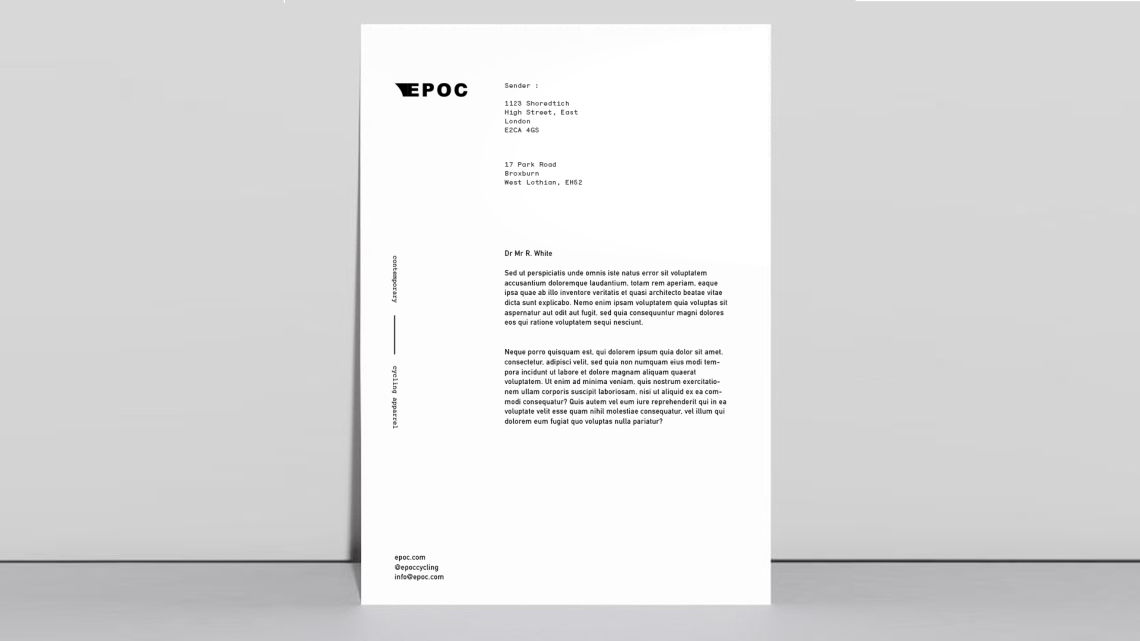
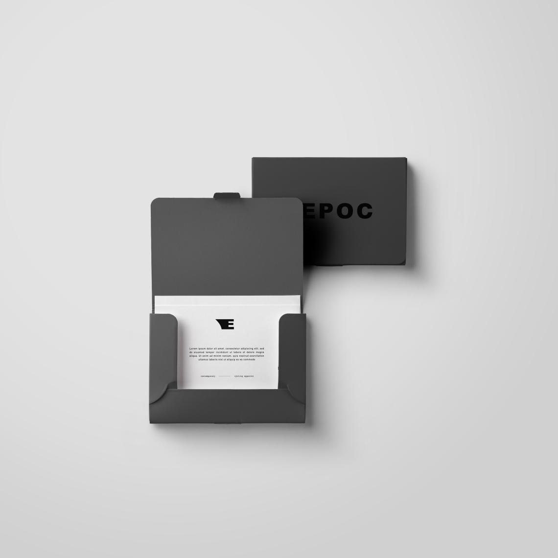
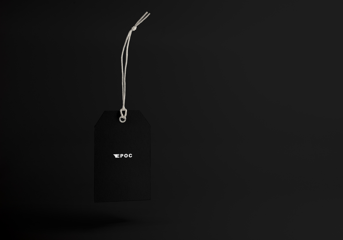
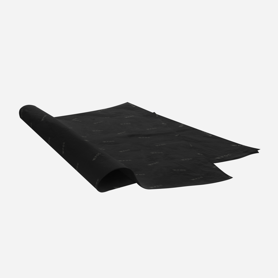
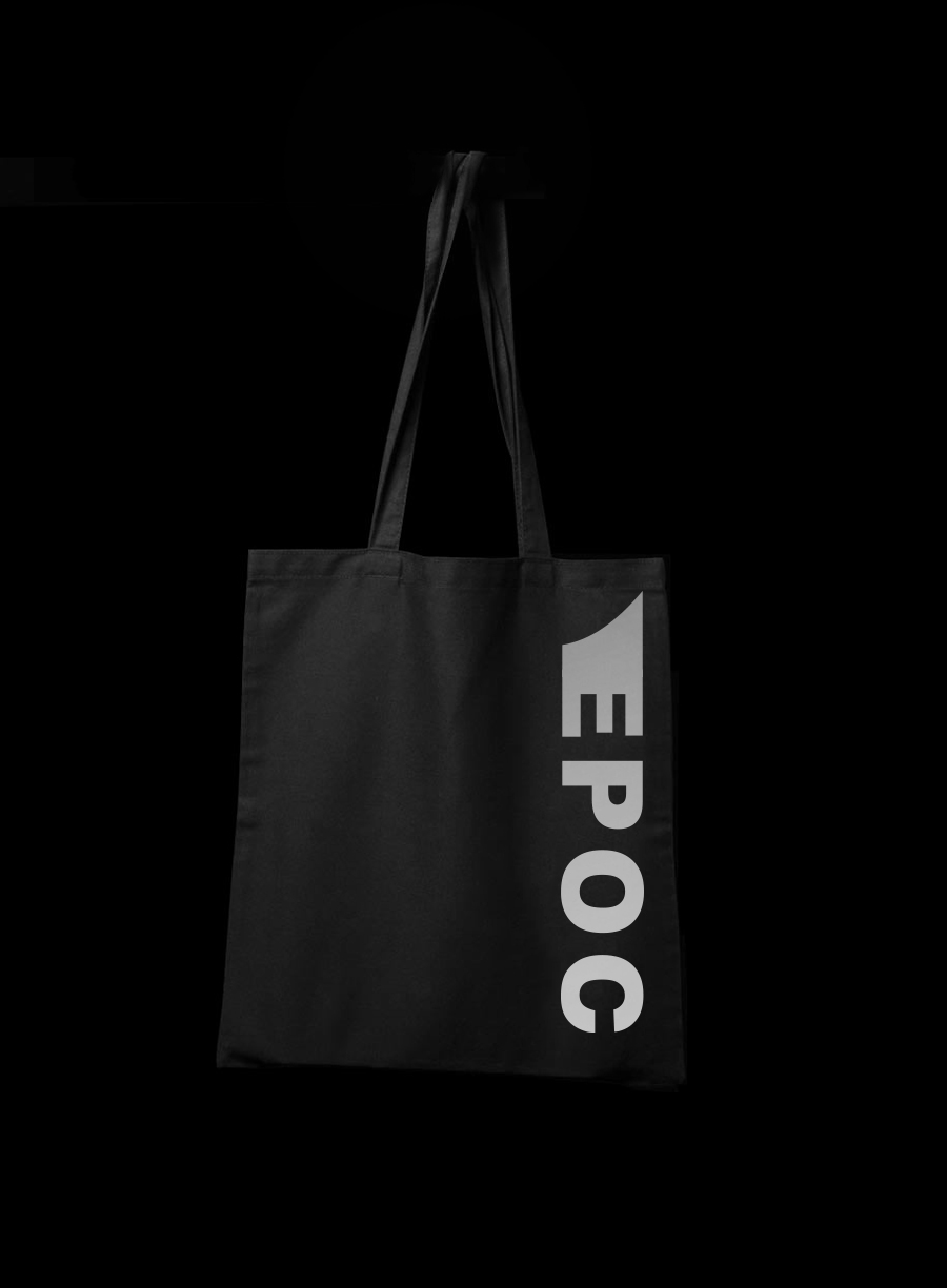
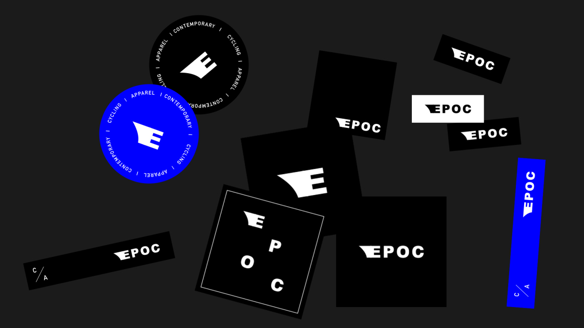
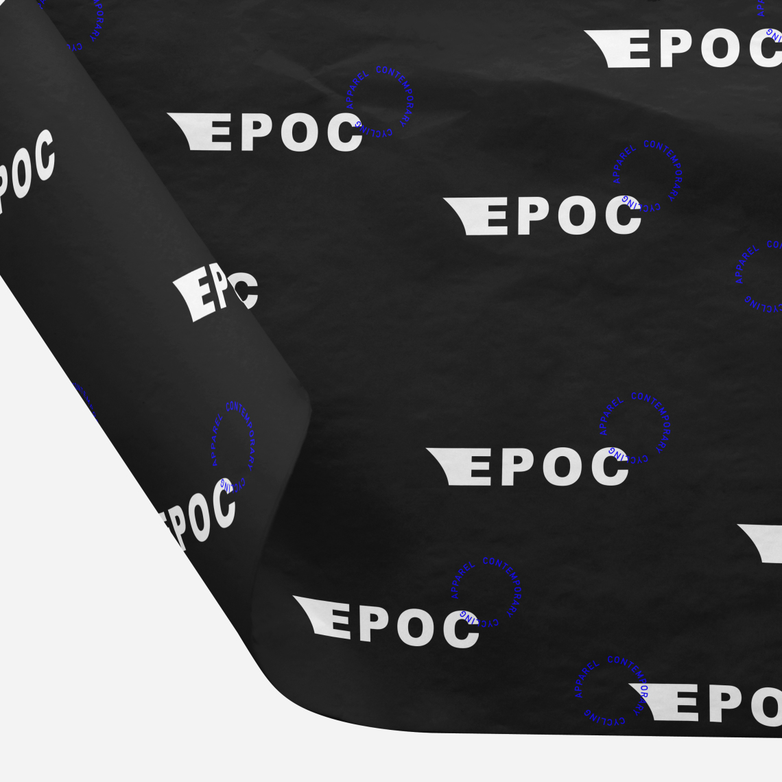
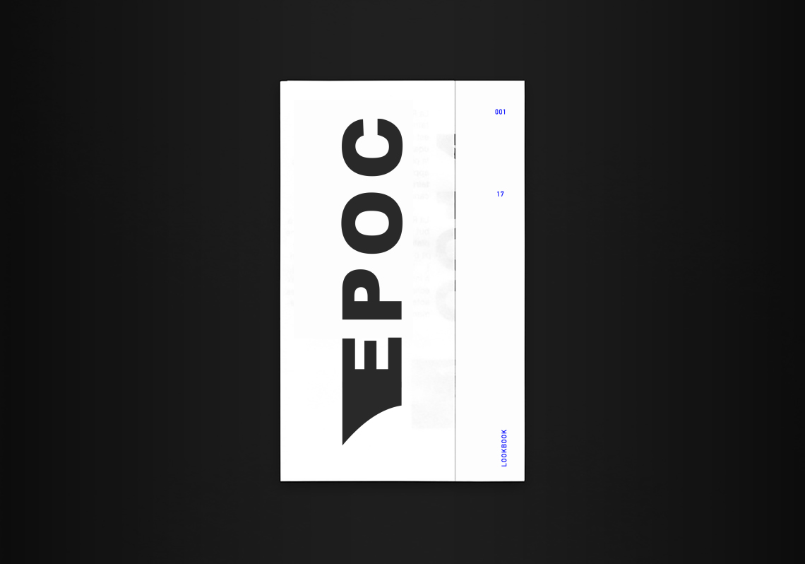
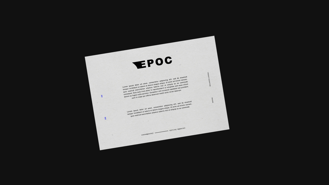
Epoc
Bespoke type and a fast E, welcome to the world Epoc.
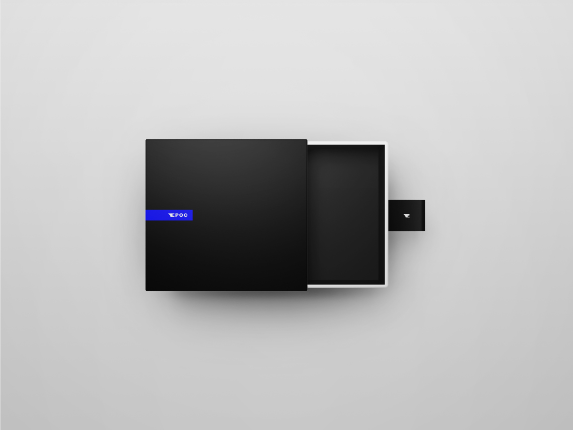
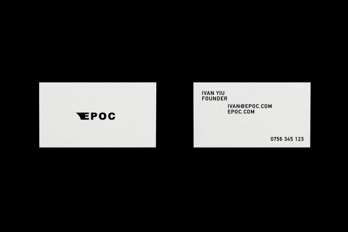
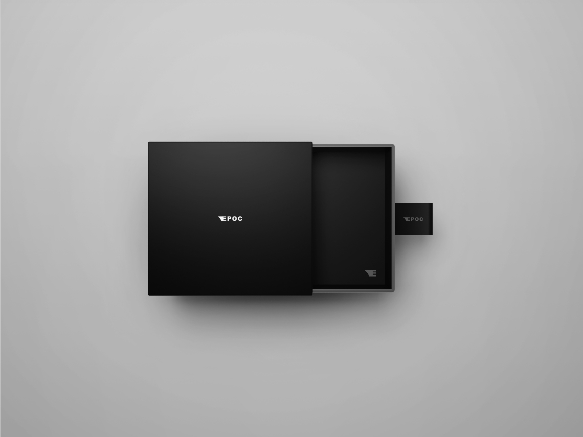
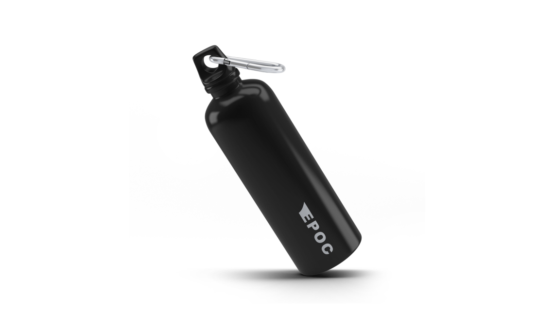
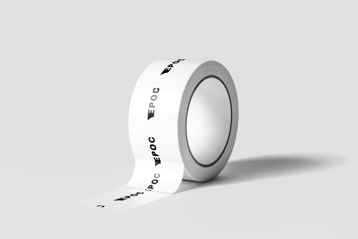
Epoc is a new cycling apparel label based in Vancouver. Epoc needed a brand that positioned them uniquely against other cycling apparel labels. As a brand based on performance, speed and agility they needed a logo that showcased their values whilst also introducing them to the market. A bold brand for a bold company.
The design of the branding had to enable a distinctive direction for the brand to develop and grow in whilst also being relate-able. The final design is simple yet effective, with a strong and bold application that differentiates Epoc against its competitors. A fast logo that has been designed with graphic simplicities and bold design motifs.